Instituto Oncológico Henry Moore
- Branding
- Visual Development
- 2026
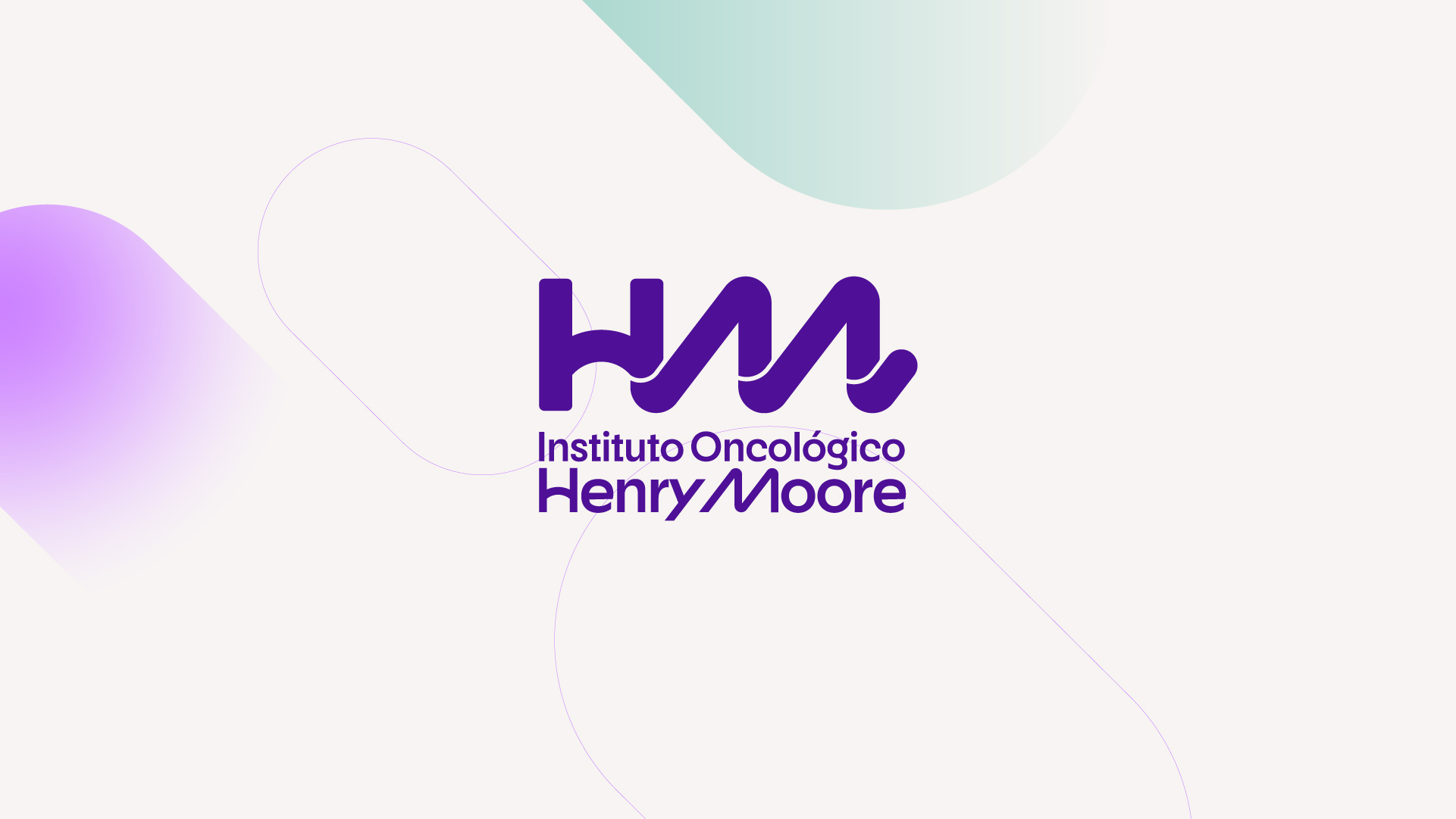
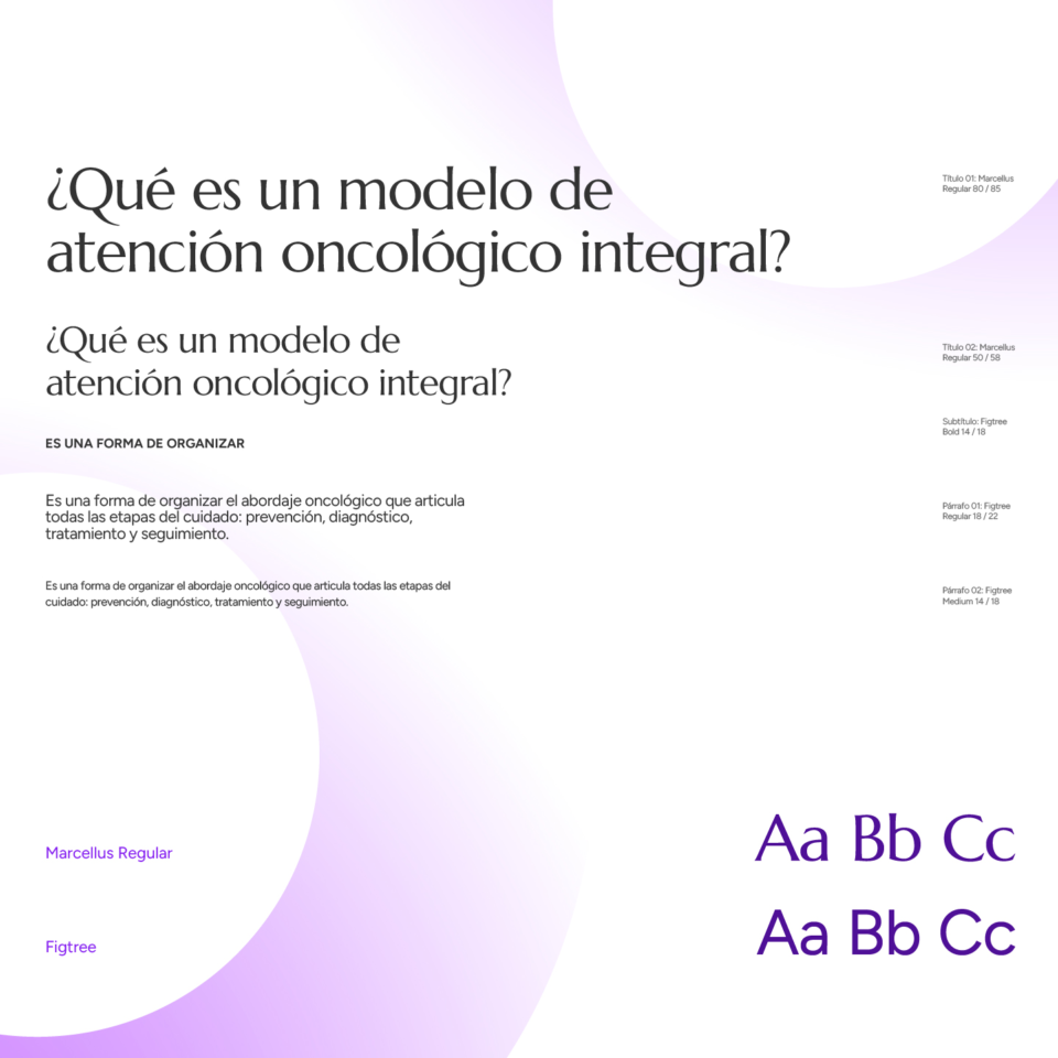
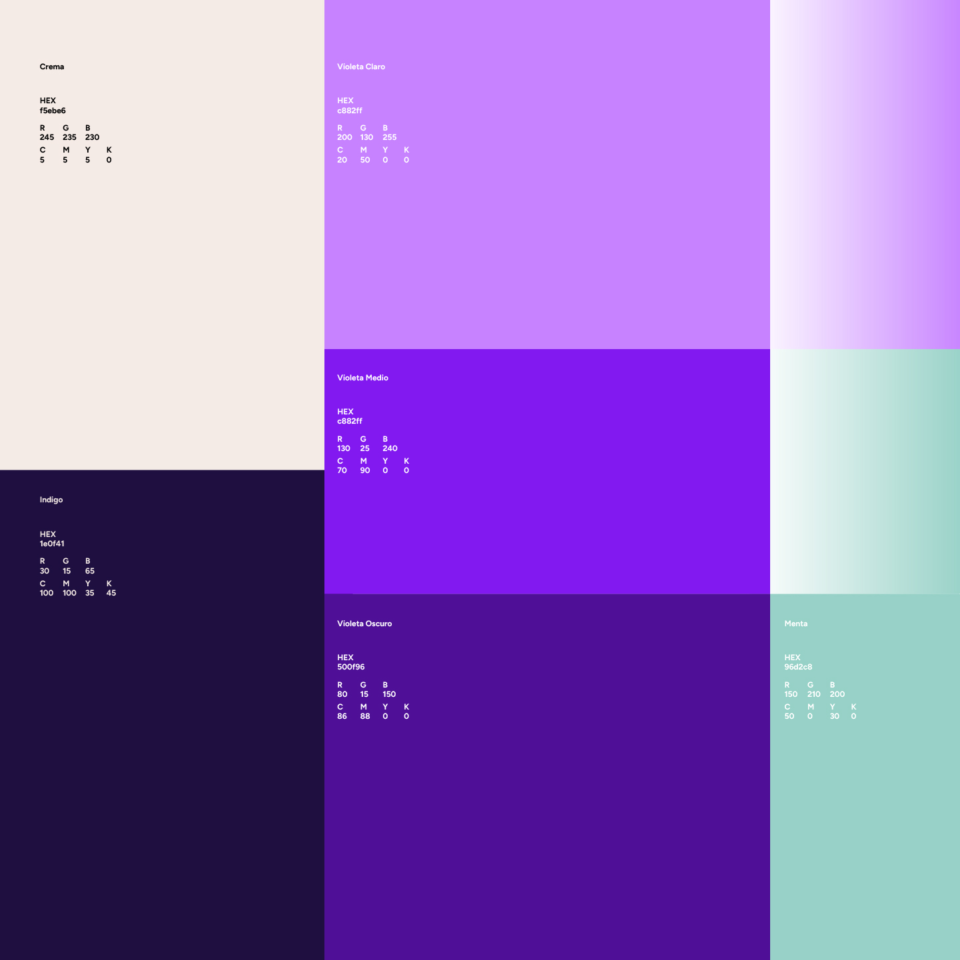
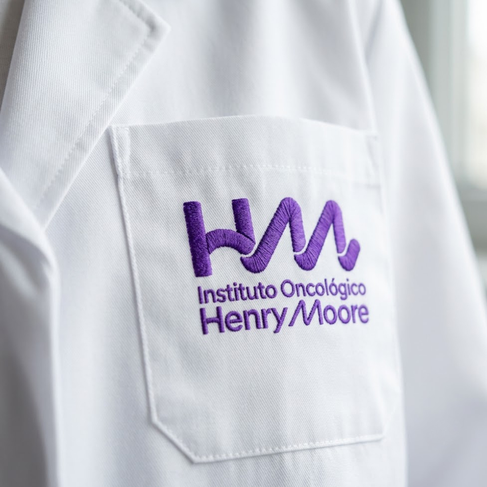
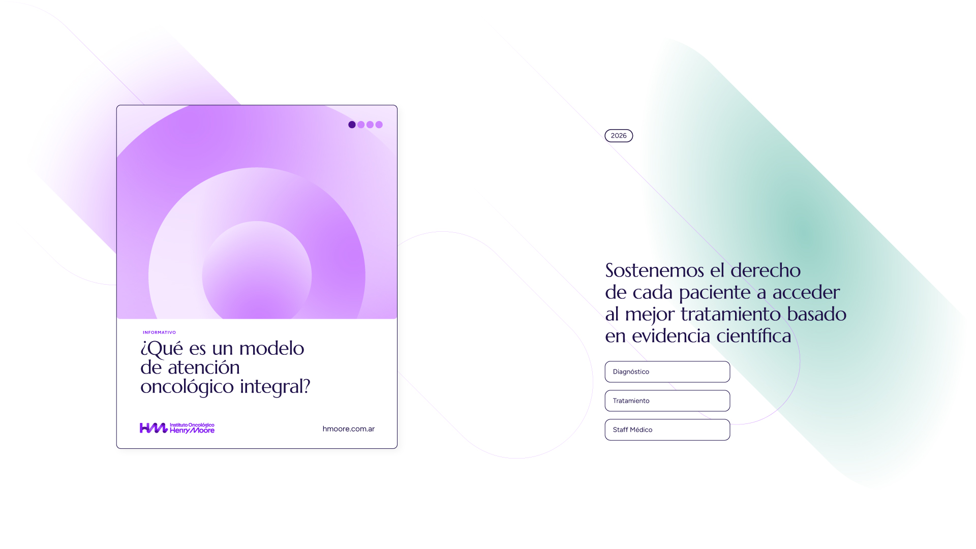
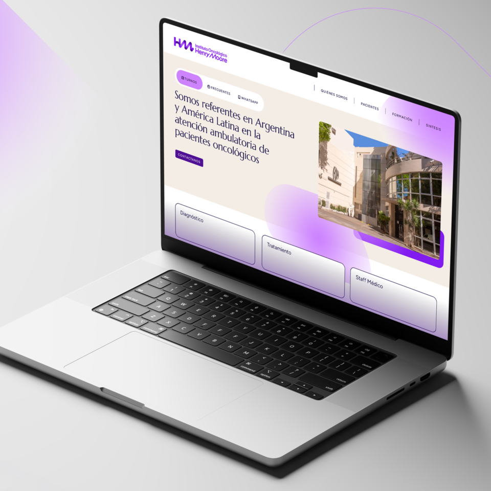
Commissioned by SI Comunicación, we developed the brand redesign and visual identity system for Instituto Oncológico Henry Moore, with the aim of refreshing its image while reflecting its warmth and medical excellence. The new identity is rooted in the relationship between the institution and its patients, with support, empathy, and care as its guiding principles. The symbol is built from the intertwined initials of the name, expressing these concepts, while the H and M in the logotype share the same formal treatment, establishing a direct visual connection between both elements. A palette of violet and cream tones, a humanist typeface, gradient patterns, and interface elements complete a cohesive and flexible visual system designed to support every touchpoint between the institution and its patients.